Music has been an integral part of our lives for ages and has significantly impacted us. You are a rock fan of music. It can be true; if you remember three components, then you are a melody composer like you remember the first music you have ever listened to, the name of the musician of that song and last but not least, how you heard it.
With technology moulding everything, music has influenced our moods. The words of Shakespeare are, “If music is the food of love, play on”. Music can help your physical and mental health in different ways. It can help you move on, decreasing your heartbreak pain and overcoming anxiety to empower better emotional expression. Many hospitals and certified music therapists use music to treat different sicknesses, including acute stress and many other problems.
The Spotify logo is undoubtedly one of the most famous in recent times. Competing with big brands like Pandora and Apple Music, Spotify is one of the largest stream providers in the world. The streaming industry has been making progress exponentially over the last decade. You can access millions of music by using this Spotify, which acts as a bridge between you and endless entertainment. The world of audio streaming is a giant and is everywhere on PCs, Tablets and smartphones.
What is Spotify?
Spotify is a Swedish online app that is accessible around the globe. Users can utilize this app using any operating system—an online service for listening to music, books and podcasts.
Spotify logo History
Spotify is no doubt one of the well-known music apps. The Spotify company started in 2006. You can access millions of songs by using this application; you only have to click on the desired playlist. It allows you to make your own playlists where you can upload songs. The original Spotify logo was Launched in 2008 by Martin Lorentz and Daniel Ek. In many European countries, Spotify became the top choice of the largest streaming providers.
Spotify is doing whatever it takes to stay one step ahead of its competitors. Most of the users have premium accounts as in 365 million users, 165 million are paying. The application has one main goal, to provide the subscribers with a piece of organized music according to their flavour.
In 2011, Spotify had one million subscribers. Since then, their followers have been increasing every second. It is one of the on-demand music apps that introduced the auto-play of your music streams.
From 2008 to 2013
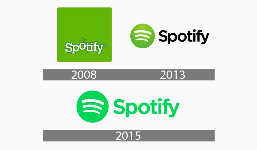
The first logo was presented in 2008 with the motivation from the popular design of 2000. It can be seen in the Airbnb’s first logo. Spotify decided not to use this component just like IKEA, another Swedish brand that feels proud to have National colours in its logo. The symbol is made of the company name written in a white serif font, outlined in dark green colour and unique background of avocado green.
The ‘o’ in the Spotify logo was more visible than the other letters. The three curved lines around the letter ‘o’ represent streaming but are called sound waves or connectivity.

From 2013 to 2015
In 2013, many companies were adopting simplification in their logos. In this manner, a slight change was adopted by Spotify. The designers removed both the bulky square and the wordmark, changing with a lemon green sphere with three curved lines. A simple Spotify and a standard sans-serif typeface were written in the dark and then placed next to the symbol, the three bent white lines in green ‘o’.

From 2015 to present
The Spotify logo was designed again in 2015, yet it was a trivial but effective change. The designers have chosen a bright green colour for both the circular logo and the wordmark. This time the wordmark was more prominent, supportive and inviting. The electric green colour gives the logo a more realistic and energetic look.
Meaning of Spotify Logo
Make sure that all the components of the logo are arranged. People believe that the design aimed to represent sound waves or associations with them. The three curved lines are used to portray sound waves or connect with most companies’ past. The design of the logo is made like the lines are bent slightly towards the right intentionally as it shows the vast and forward thinking of the company.
The circle can be used to show the world, enabling data to absorb any music. To make sense, digital companies use the circle to lead the company’s worldwide connections, which is normal.
The lemon green colour shows the company’s fast growth and innovative ideas. Around then, no company aside from Spotify chose the green colour as the companies were not related to it before him. The colour in the watermark and the circle is green as it shows nature. That is why Spotify chose the unnatural green for updated versions.
Shape and Symbol of Spotify Logo
The first logo was made as a squircle, a shape that intermediates between a square and a circle. A Square can represent many things it can be in any direction east, west, north and west. It is a component of nature, and it can mean many things water, air, fire and earth. The circle can show strength and commitment and is simple, friendly and eye-catching. While the circle is a general sign of association and addition, the three curved lines have been used to address sound waves (melodic energy or waves) or connections in the past by most companies. The lines also express that they are free to move, have clear thinking and are never-ending.
Bottom Line
The simple logos are easy to remember, as Spotify’s logo is the perfect example of how a simple logo can convey information. Unique logos are consistently recognized as they can’t be overlooked or forgotten without any problem. The plan is simplified and straightforward, with unique colours and a piece of profound information behind it.


